Lasso
Designing a modern solution to the overcrowded, over‑complicated world of streaming services.
goal
Empower users and minimize choice paralysis with a personalized app that consolidates streaming services. Design a modern browsing experience and give users easy access to the content they already pay for. Introduce this platform with a streamlined onboarding workflow.
skills
- Storyboarding
- User flows
- Wireframing
- User testing
- Interactive prototyping
- Product design
- Logo & identity design
date
Spring 2017
Concept
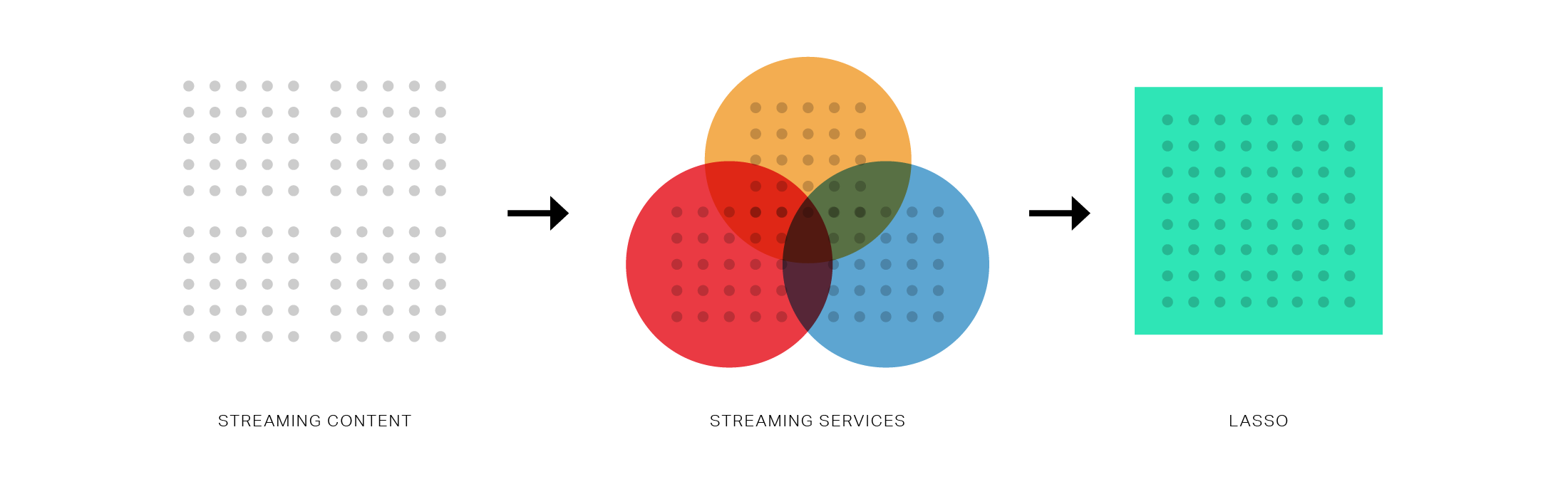
The first generation of streaming video services, led by Netflix, Hulu, and others, has been a competition measured by the breadth and quality of content. Each platform strives for binge-worthy exclusives and original programming. The result for customers, however, is access to thousands of movies and TV shows divided across multiple walled gardens with access to content heavily obscured by algorithms and business incentives.
This means Netflix and the like often offer biased or inaccurate content suggestions, leaving users to unhappily browse for extended periods of time when looking for something to watch. Lasso was designed to be a second-generation streaming platform, acting as a consolidated library for the content offered by existing publishers.
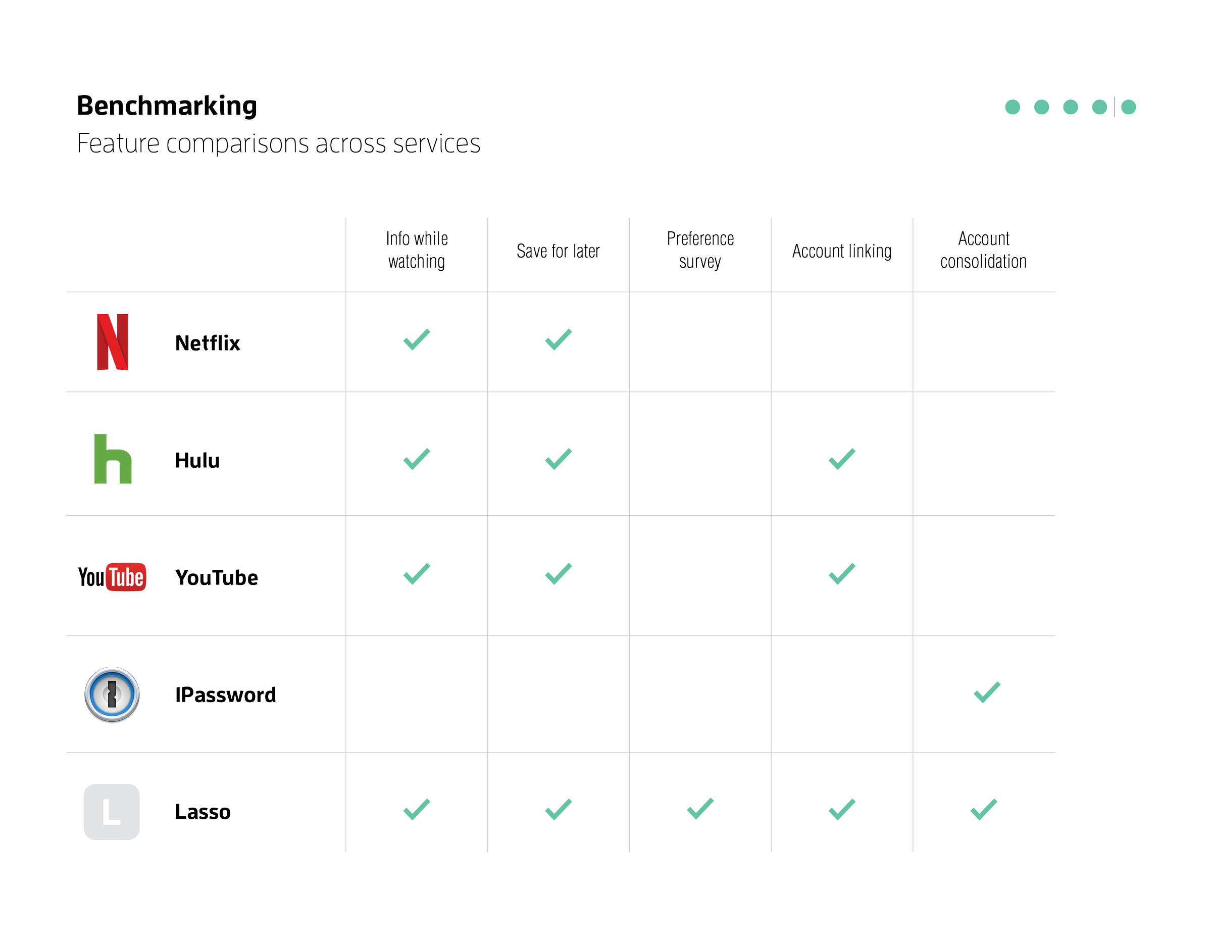
My process began with research and a competitve analysis. More than 50% of streaming video subscribers under 45 subscribe to more than one service. 63% have a cable subscription in addition to one or more streaming services. It is ridiculous to require these users to keep a running list of where and how to watch their favorite TV and movies. It is unethical design to bury legitimate content under dozens of Netflix (or Hulu, or Amazon) Originals. Entertainment should not require boredom or frustration. Paying customers deserve a smart and human-centered browsing experience.
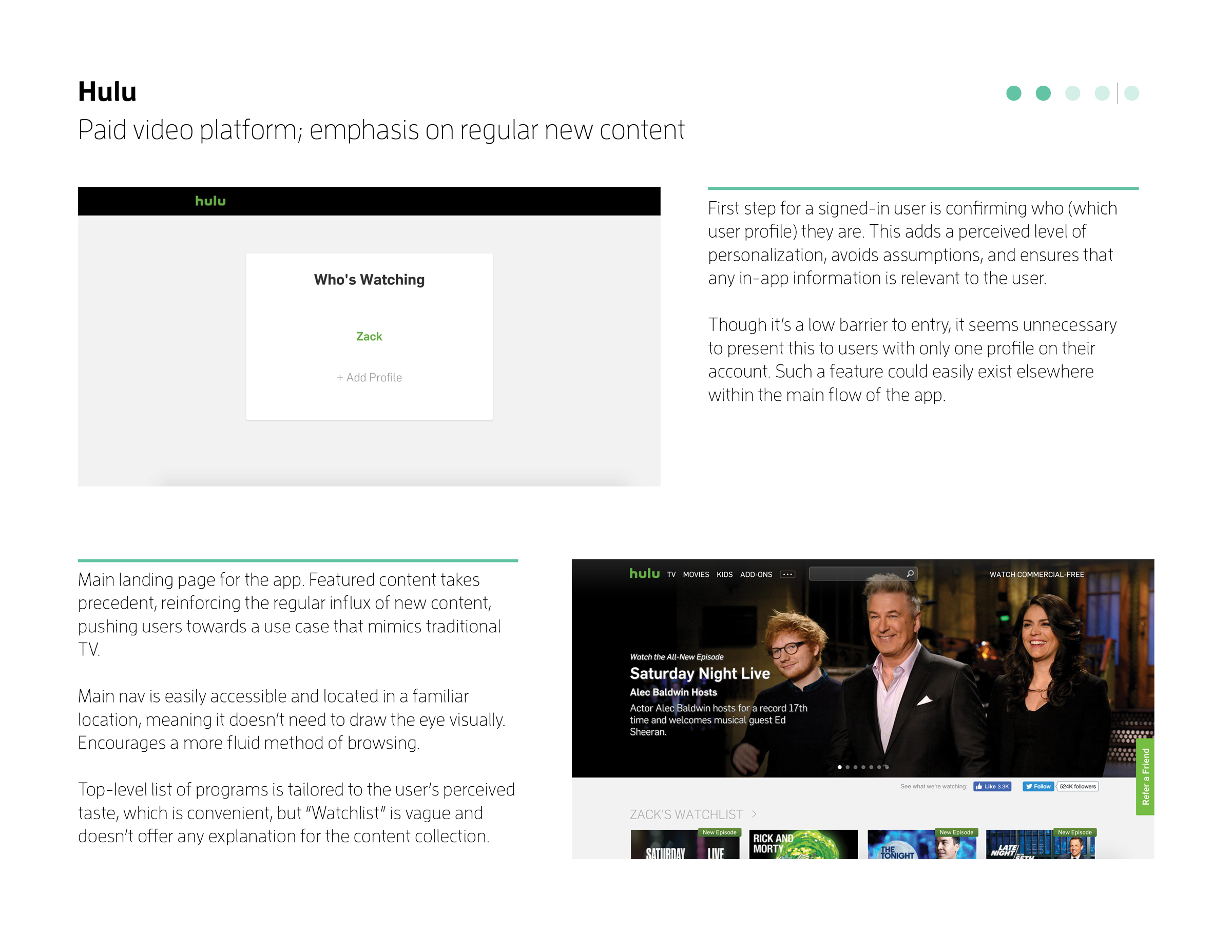
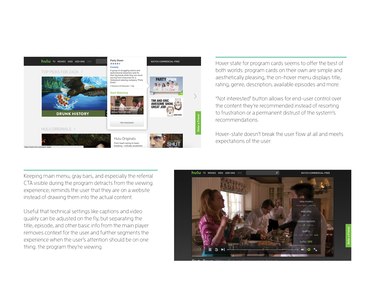
Keeping this in mind, I analyzed Netflix, Hulu, Youtube (streaming services) and 1Password (account consolidation) looking for strengths, weaknesses, and common design patterns.
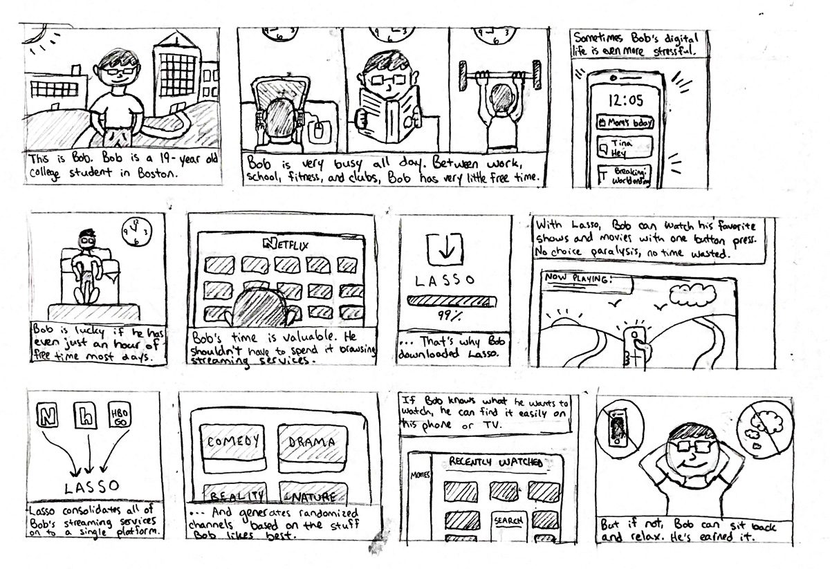
Storyboarding
After auditing the competition, I created a series of personas and scenarios to better understand the motivations of the end user. While these people and situations are entirely imagined, I believe that creating detailed and authentic personas early on in the design process is crucial to solving real problems in a way that resonates with real people.
By actively brainstorming edge use cases, I could also begin building a preliminary feature list early in the project lifecycle. High-priority personas denoted core user scenarios and were used as success metrics throughout the project lifecycle.

User Flow
Once general features and functionality had been decided, I created a user flow chart. By diagraming a user flow I was able to clearly see the relationship between various features and different pages of the app; this helped to ensure a sensible onboarding progression without any dead ends. Having a comprehensive user flow chart was also incredibly helpful when it came time for wireframing and prototyping.


Wireframes
The user flow chart became the blueprint for gray box wireframes. Using Adobe XD, I created screens for each stage of the user flow. I restricted myself to only Helvetica Neue and a predominantly grayscale palette so that I could conduct user tests at arbitrary fidelity with minimal visual distractions. Once the static wireframes were complete, I linked the screens to create a clickable prototype for user testing.


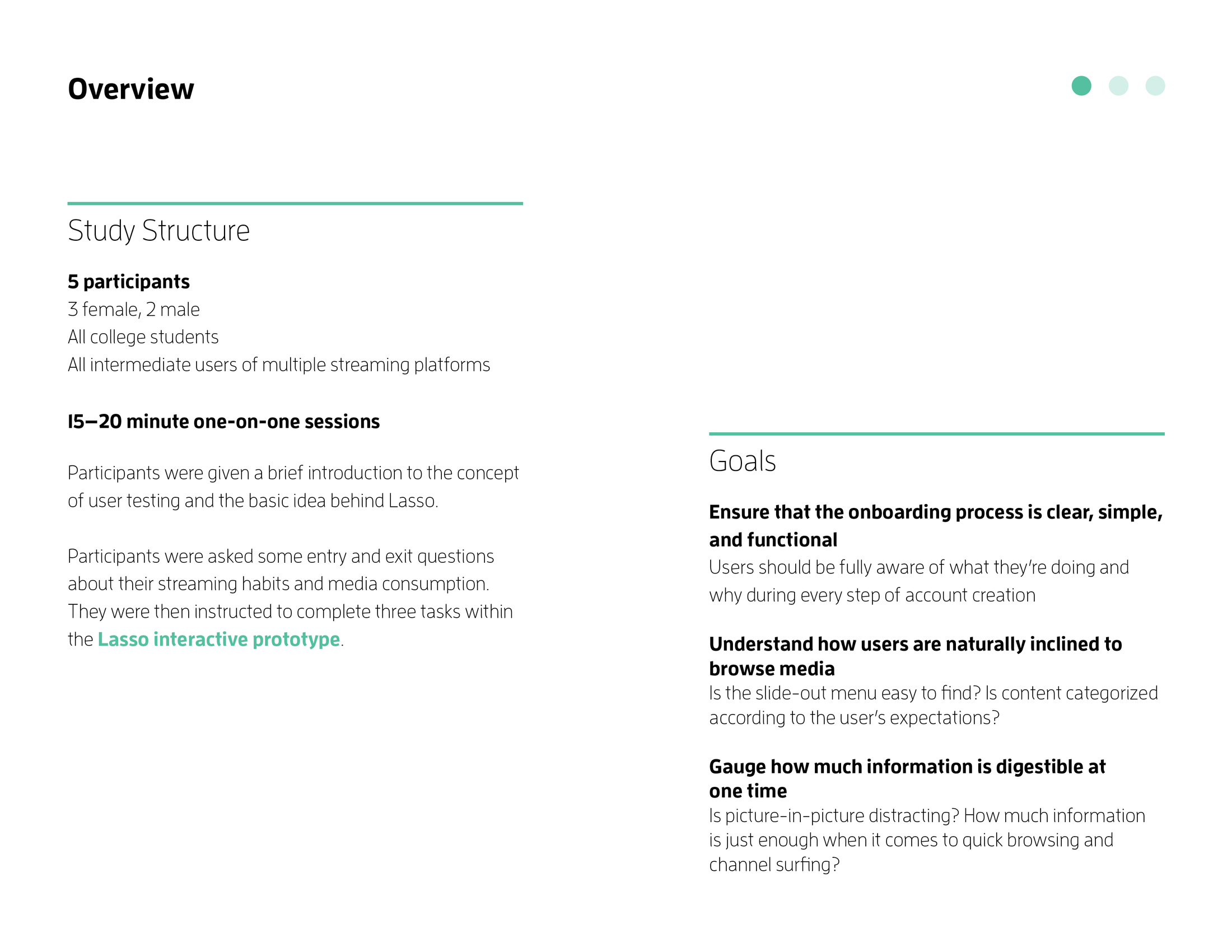
User Testing
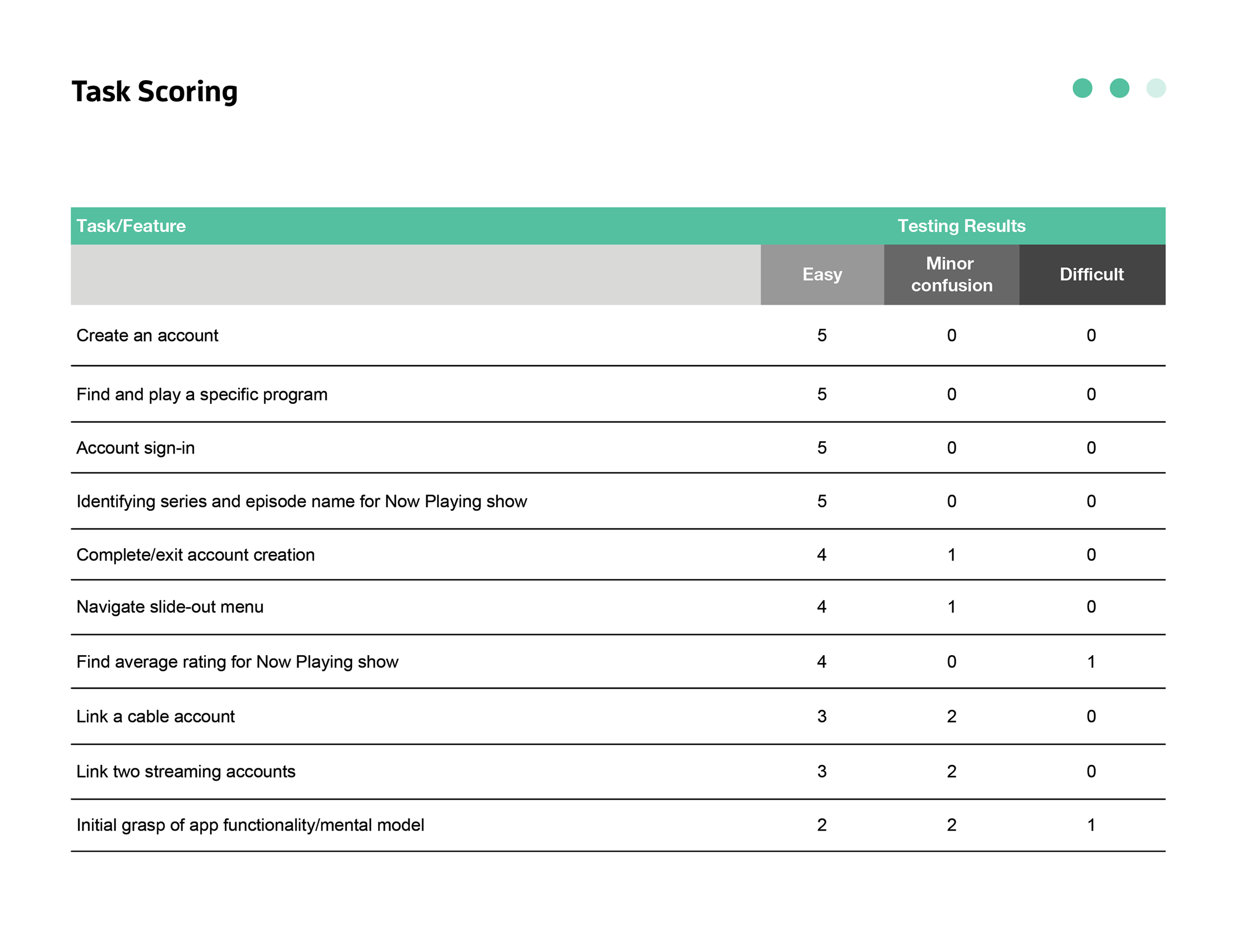
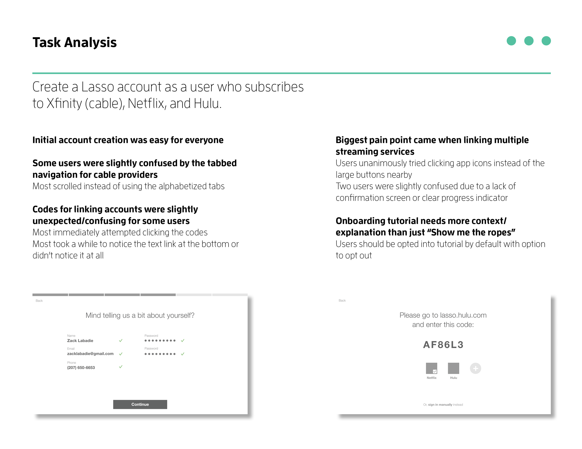
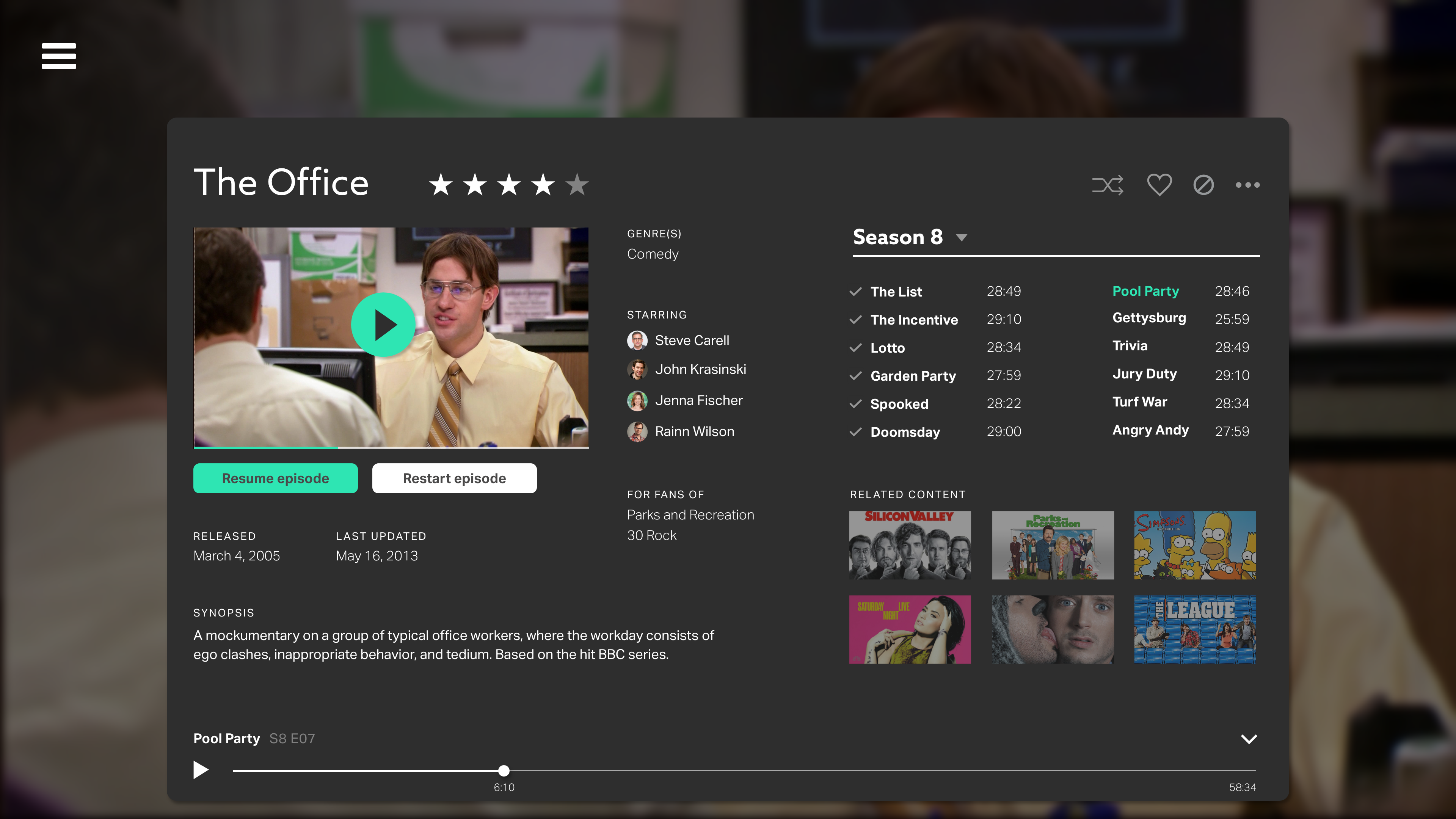
Once the interactive prototype was ready, I drafted a usability test based on common user scenarios. I set key goals for the test along with a description of ideal participants. The usability test was designed to last about 15 minutes, including a brief introduction from me, some background questions for the participant, and several basic tasks such as "Please find and play an episode of The Office". I took notes throughout the test as well as screen recordings. I then compiled the results into a usability summary which included difficulty ratings for each task, direct quotes from users, and other insights.
One of my most important goals when user testing was to ensure that the Lasso onboarding process was simple and easy to understand. A smooth onboarding experience was critical to getting new users into the app and quickly demonstrating value. I also used user testing as an opportunity for user research, learning more about user's browsing habits and how they digest information. Testing results were generally positive, but did reveal opportunities for improvement that might have otherwise gone unnoticed; these include minor changes such as making copy more descriptive, and more major changes such as introducing in-app tooltips to explain key features.
Logo & Design System
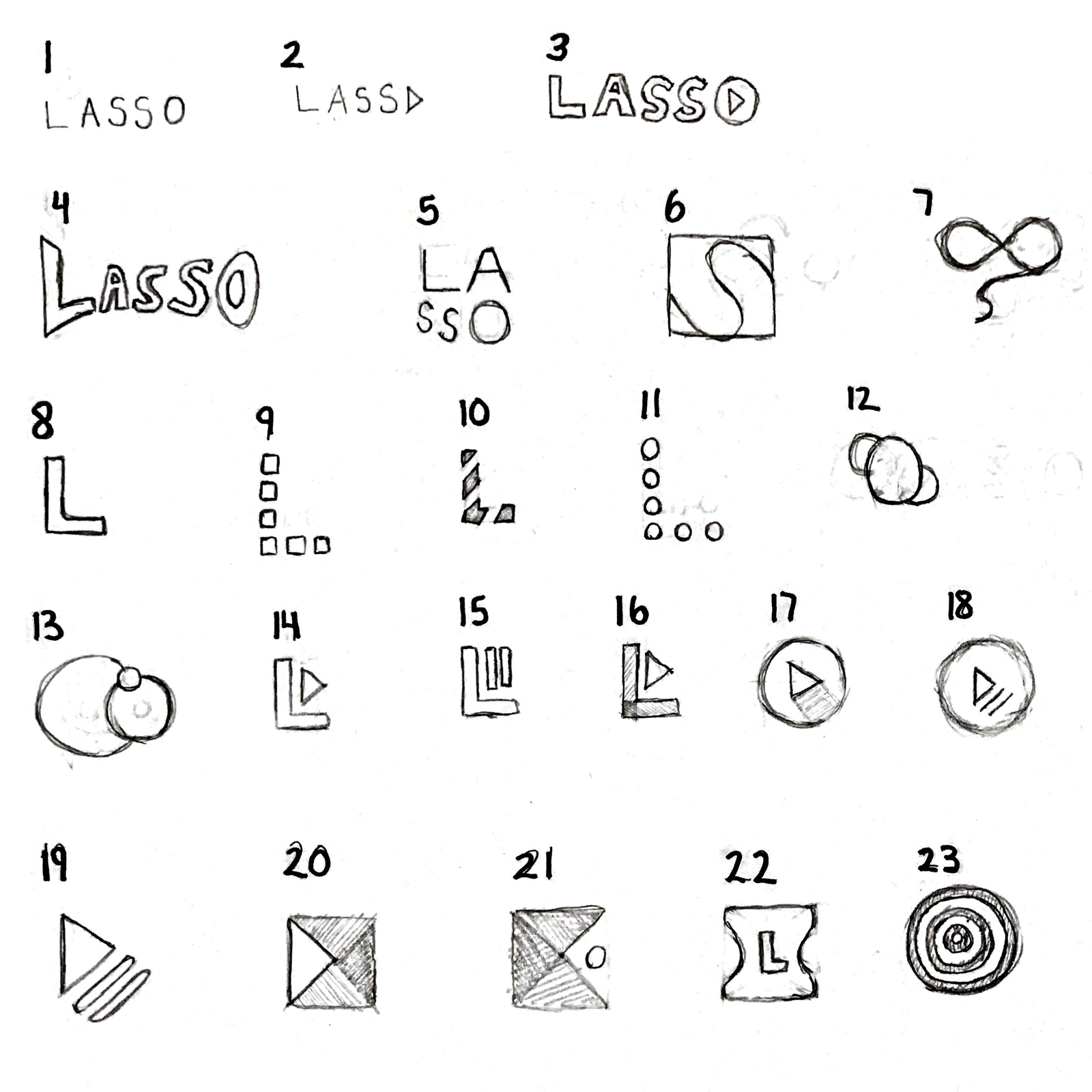
After updating the Lasso prototype to reflect insights from user testing, I began developing a logo and visual identity for the app. Although this project's primary focus was on user experience and interaction design, I believe cohesive visual design is fundamental to both. I began with the logo, sketching dozens of ideas inspired by video iconography, the letter L, and the concept of consolidation. These were narrowed down to two options, each with several color explorations, before the final logo was chosen and further refined.
I then expanded this branding into a design system that could be applied throughout the application. Since Lasso was designed for televisions, it features large typography that's legible from a distance and a dark background ideal for low-light environments. Primary and secondary brand colors were used sparingly throughout the app, meant to pop against swaths of black. Azo Sans was used in headers to inject a bit of personality, while Aktiv Grotesk was used in forms and body text due to its simplicity and legibility at small sizes.


Visual Development
The final step in the Lasso design process was bringing my interactive prototype to full visual fidelity. Thanks to user testing, wireframes already existed for almost every page of the app; I simply had to introduce new typography, colors, and imagery throughout. I made final edits in context, mirroring my laptop display on a 60" TV. You can check out the full prototype here.


Next steps
Lasso is far from finished. One area of particular interest is further developing preference tools that could aid in Lasso's AI while empowering users who prefer fine-tuned control. By aggregating the data of several streaming apps, Lasso could form a more holistic image of the user's preferences and habits. I believe this is the first step towards a modern, human-centered TV viewing experience. I believe it's also crucial be transparent about these algorithmically-derived insights so that when they're wrong, users are able to correct them without confusion or frustration.

