Compile
Designing and developing an online magazine that celebrates the weirdness of modern technology.
goal
Challenge the status quo for online editorials by creating a digital quarterly that mirrors the content, craft, and curation of independent print magazines. The weirder the better.
skills
- Project management
- Wireframing
- Information architecture
- Branding & identity
- Illustration
- Animation
- Editorial design
- Front-end development
date
Fall 2017
Ideation
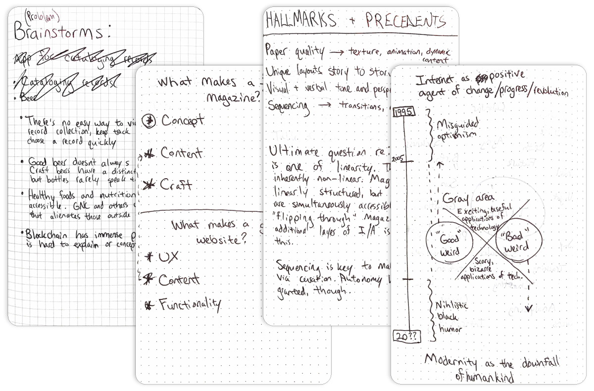
Compile, my undergraduate degree project, only started taking shape after a lengthy ideation process. I began by drafting constraints in the form of personal, professional, and academic requirements for the project in question.
Keeping these things in mind, I opened myself up to inspiration. Ultimately, my interest in storytelling, experience with web development, and admiration for indie magazine design led me to an expressive tech-focused web/magazine hybrid called Compile.
Research
With a direction in mind, I began researching precedents. I purchased over a dozen leading (design-forward) independent magazines, analyzing content, stylistic choices, and medium-specific nuances perhaps otherwise taken for granted. I then did the same with online longform publishers and immersive web experiences.
I found that many “digital magazines” are in fact either content-rich blogs or lifeless PDF scans of print publications. If Compile was to be successful, it would need to convey the confidence, creativity, and quality of print magazines while embracing its digital medium by leveraging the immersiveness and interactivity of modern web design.
Content
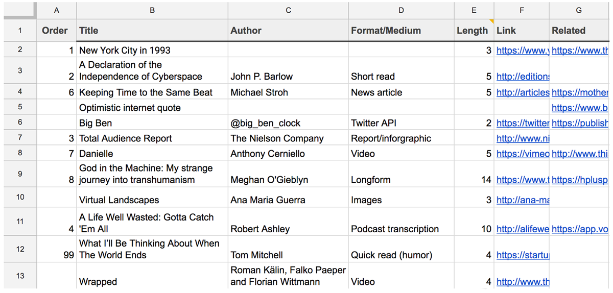
Content collection was an ongoing effort throughout the project lifecycle. I decided early on that curating magazine content using pre-existing media would be the most feasible and enjoyable way to source content.
The theme for Compile 001 would be Time. I kept a spreadsheet of potential content sources which acted as an editable overview for the magazine, allowing me to easily rearrange content and assure I included a variety of media types. My goal was to amass enough interesting content to engage users for at least 30 minutes from start to finish.
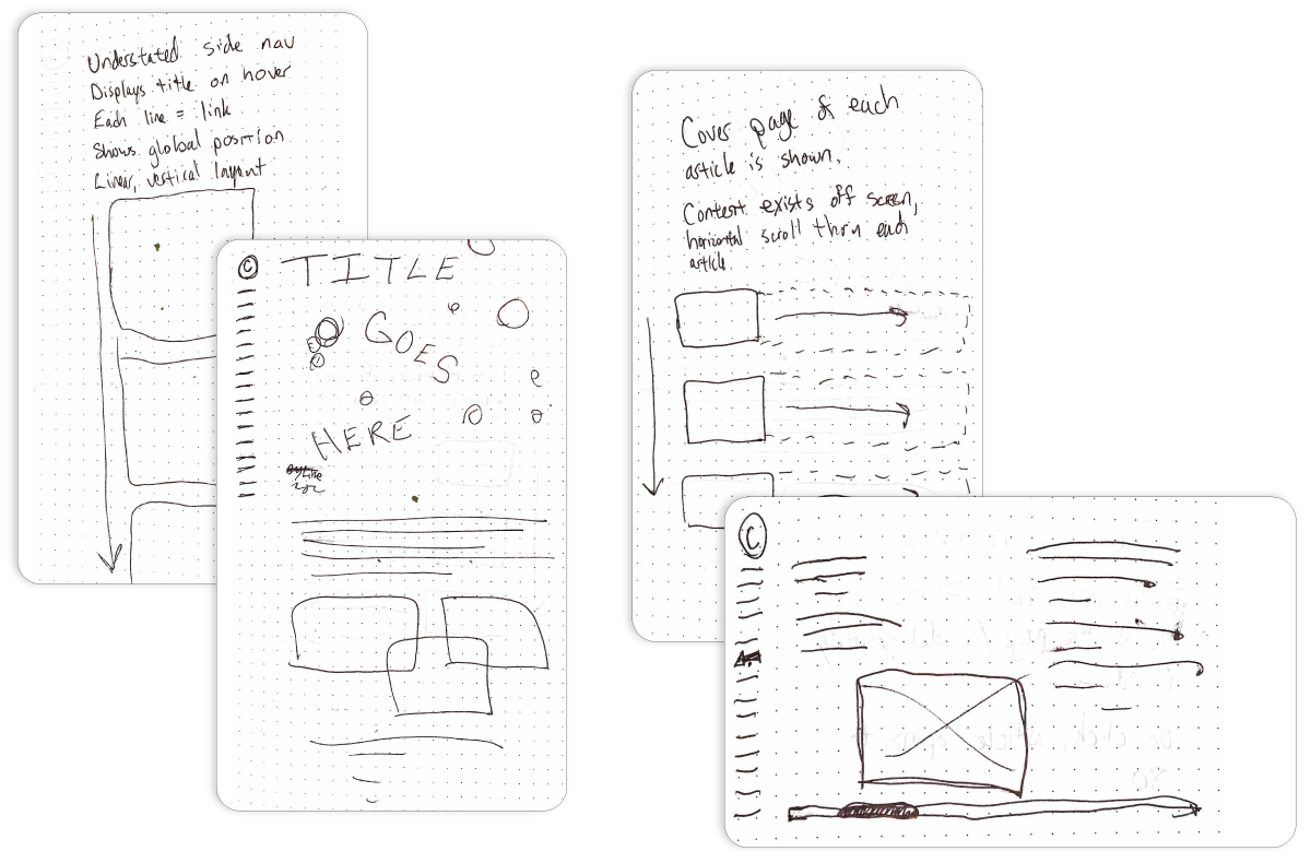
Wireframes
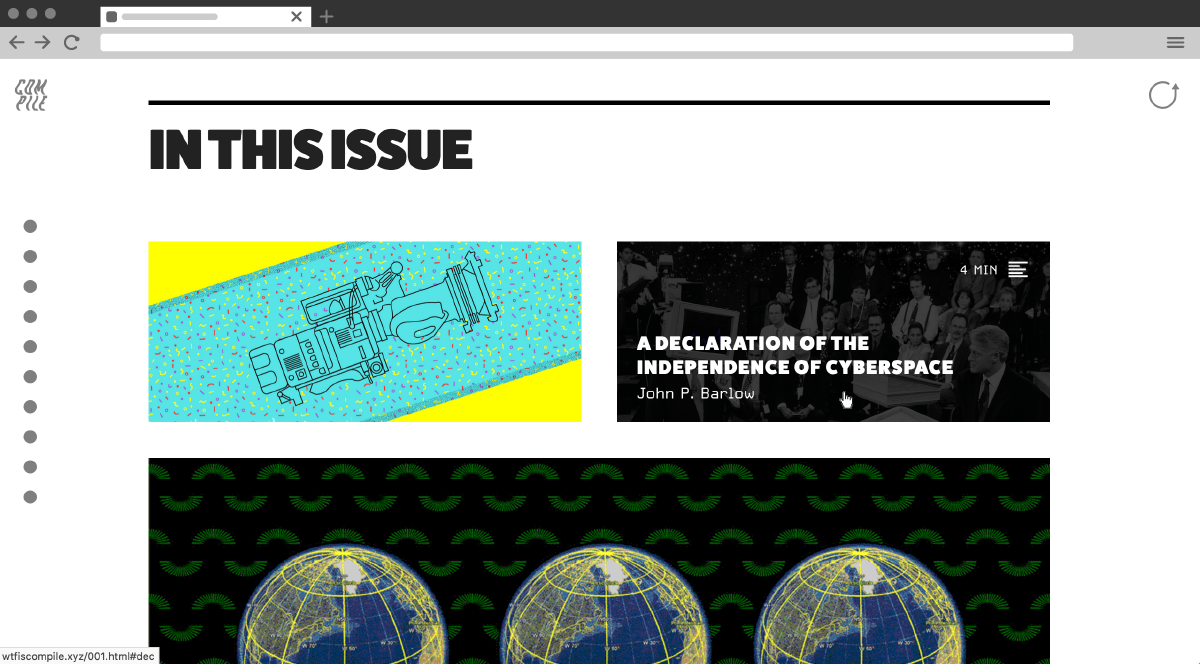
I drew out the general information architecture for Compile leaning heavily on the familiar experience of flipping through a print magazine. I decided that curation would be most effective if content had an intentional progression, but also wanted to give users the option to casually hop from article to article.
I then drew rough wireframes considering the user flow through each issue. Each direction was made into both graybox and high-fidelity wireframes using Sketch.
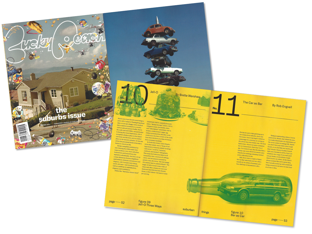
Visual Design
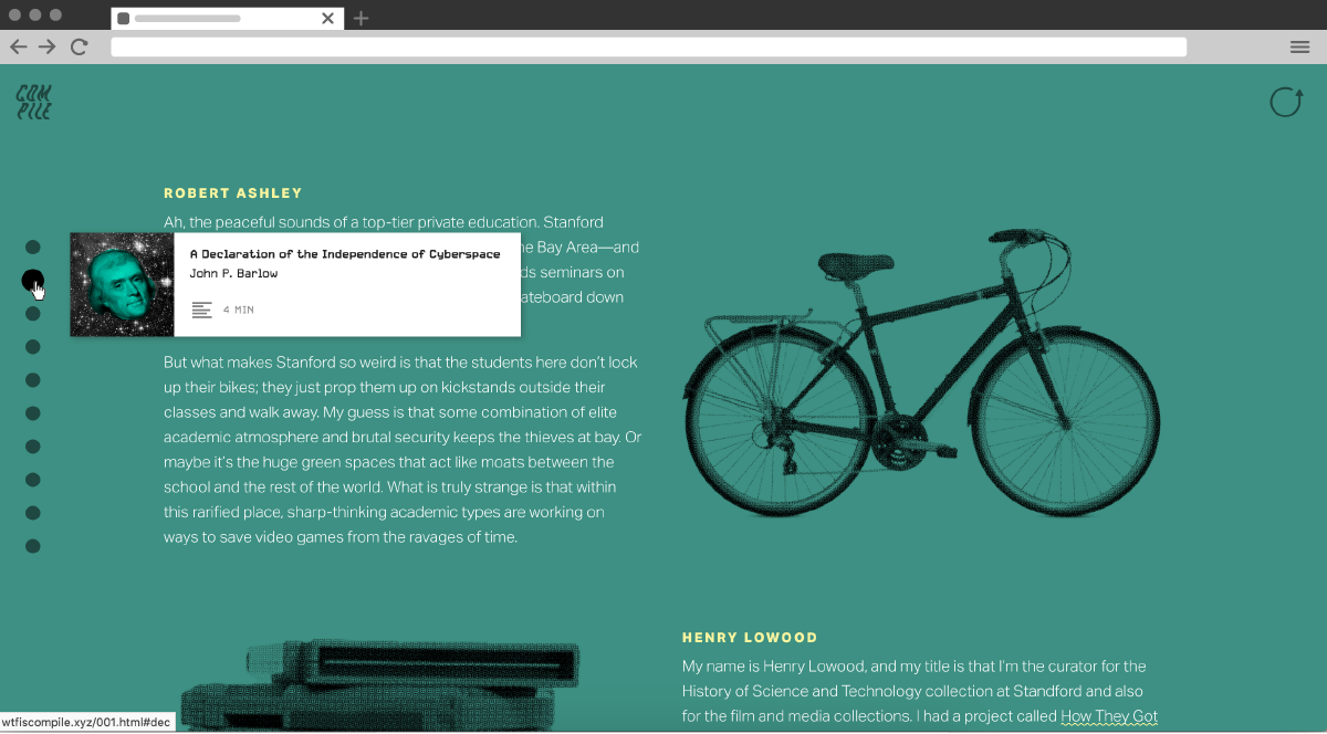
One of the core motivations for Compile was to break out of the cookie-cutter layout shared by most blogs, instead giving each article a unique design treatment that could amplify or recontextualize the themes and tones within. Pitchfork and The New York Times succeed in this with many of their longform editorials and interactive features.
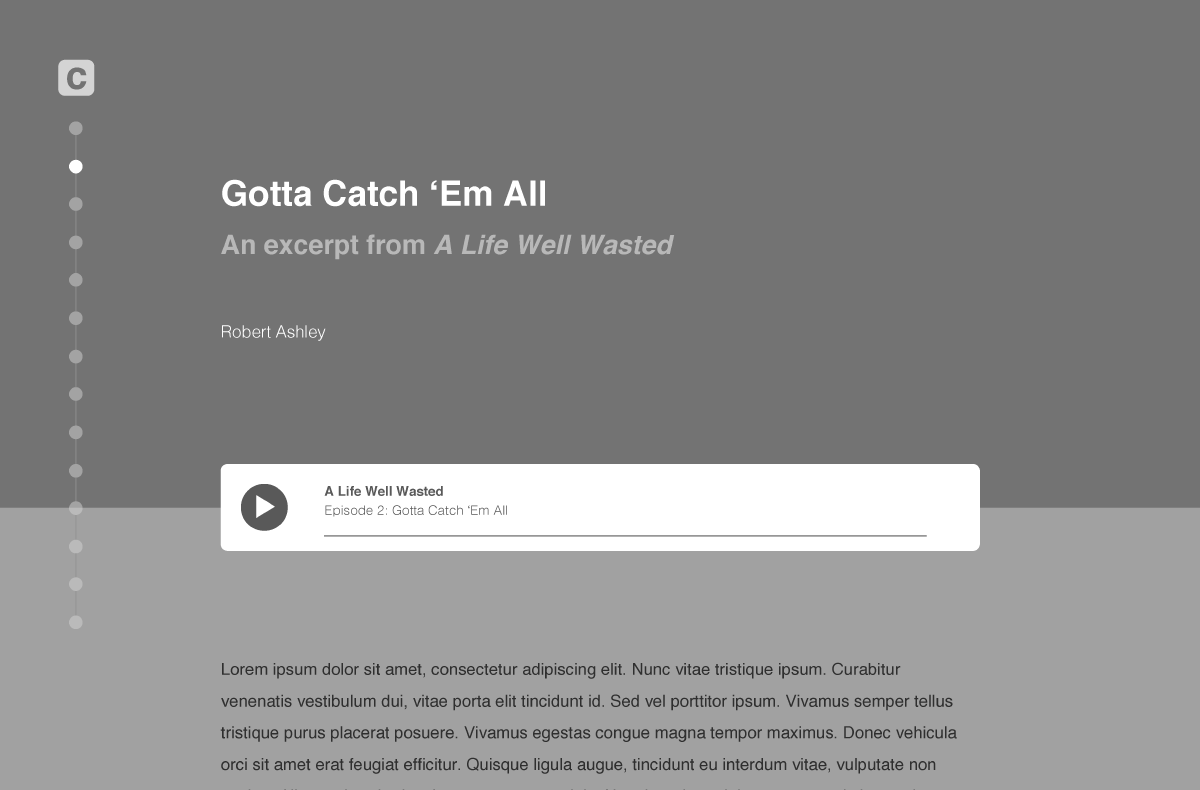
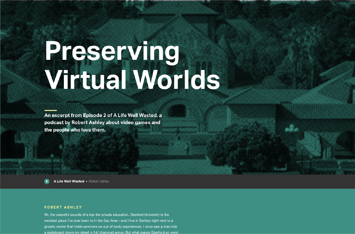
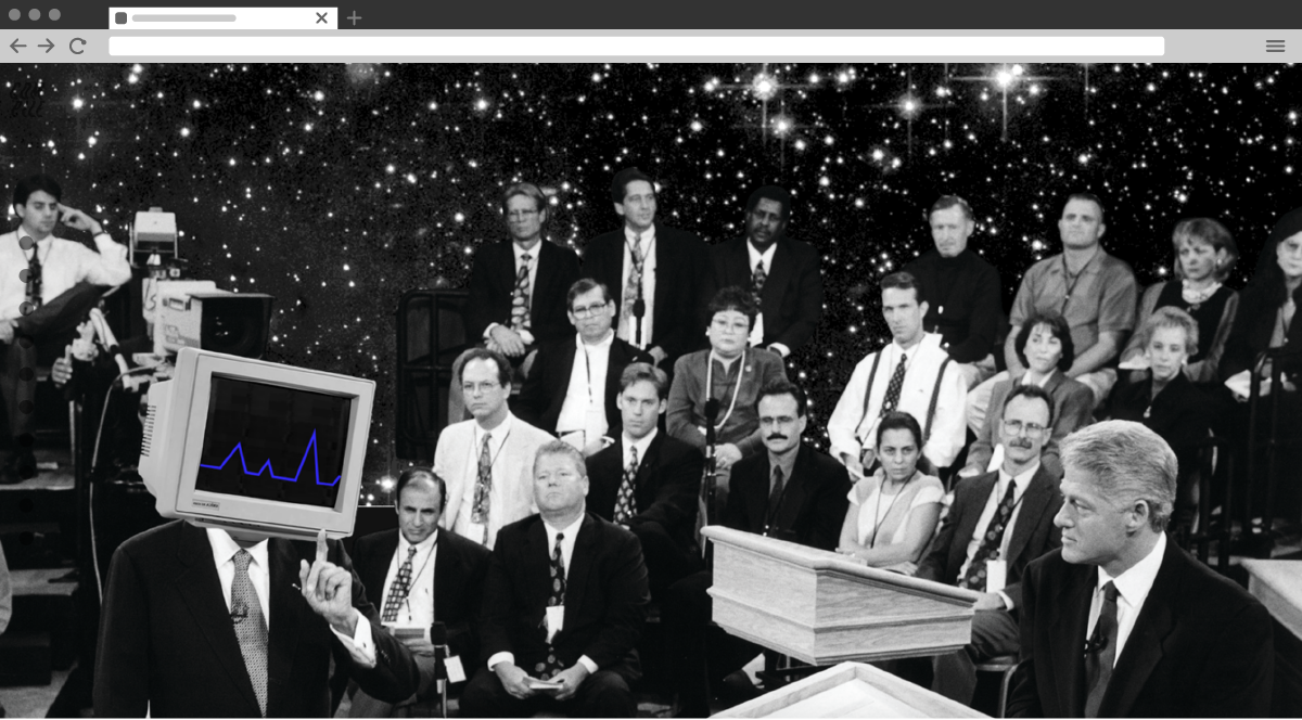
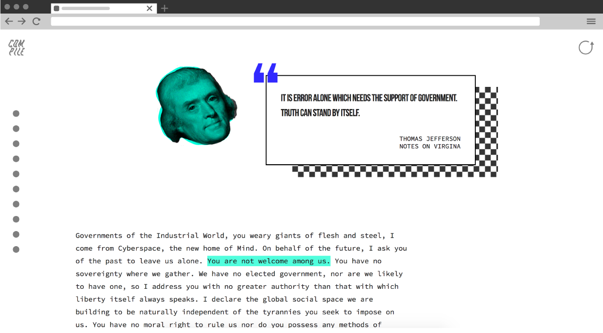
To emphasize the uniqueness of each piece of content, I designed each "article" using a unique layout, font pairing, palette, and graphic style. With the exception of found photography, all graphic elements and compositions are my own. I encourage you to see them in context.


UI Design
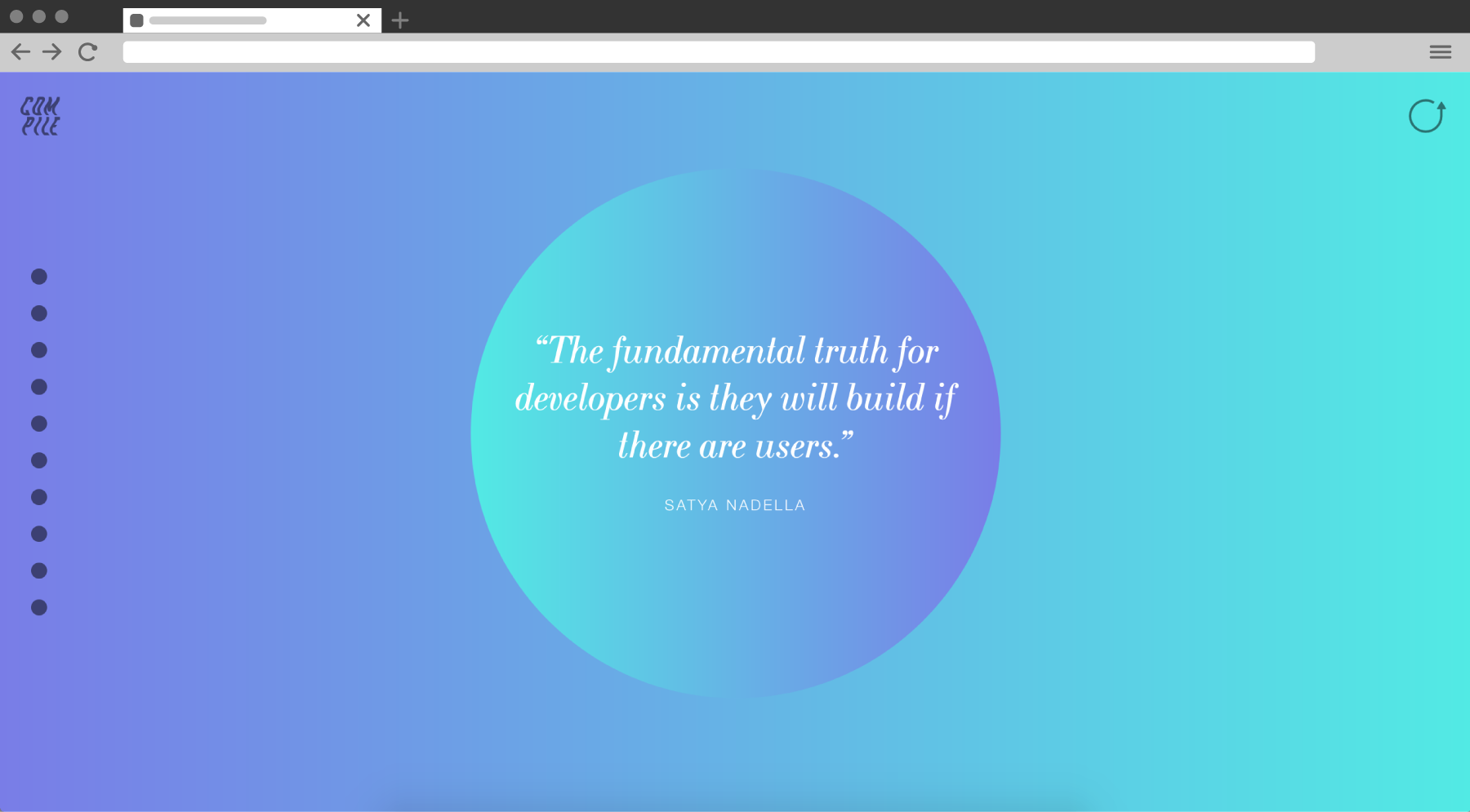
Every issue of Compile is presented as a single long-scrolling experience where each article bleeds into the next. The table of contents acts as a potential jumping off point for users looking for a specific piece of content. A fixed timeline on the left edge of the browser window acts as on-the-fly navigation, encouraging exploration.
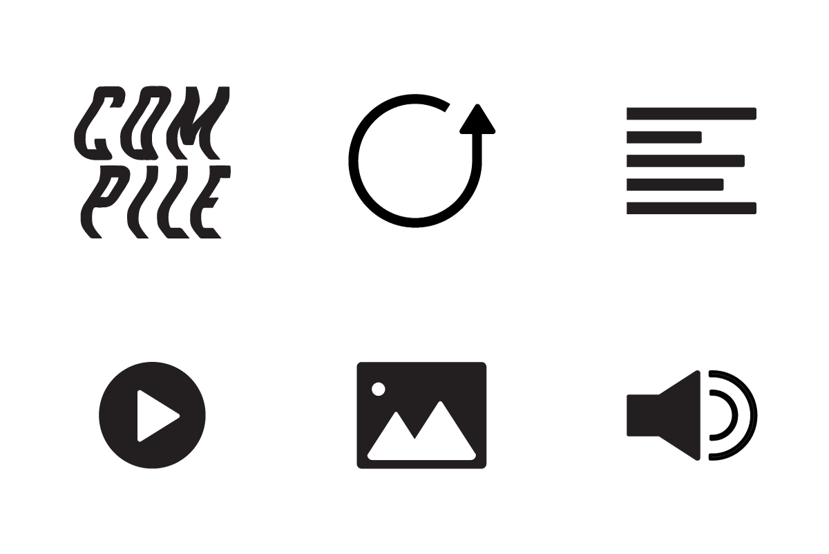
The icons used throughout Compile are intentionally simplistic, letting the content take center stage. The top-left Compile icon links to the site's landing page while the top-right icon scrolls the page back to the start of the issue.
Branding & Identity
I knew from the outset that I wanted Compile to be weird, expressive, and (if possible) darkly humorous. In short, I wanted to make something that I would give my attention to if I stumbled across it online.
I saved the Compile identity for the final stages of my design process so that content collection and article design could be guided by a general ethos but uninhibited by a visual identity. This allowed me to create the bulk of the first issue, then use it as inspiration for an authentic wordmark and identity.
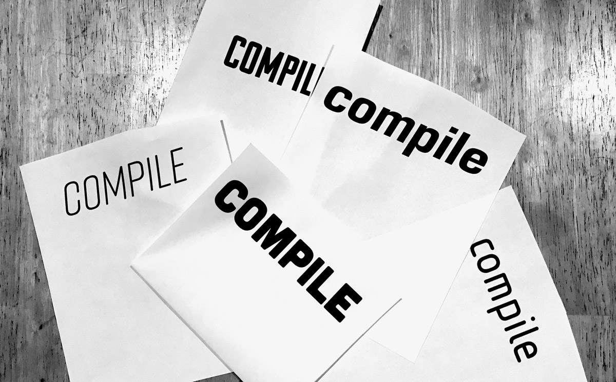
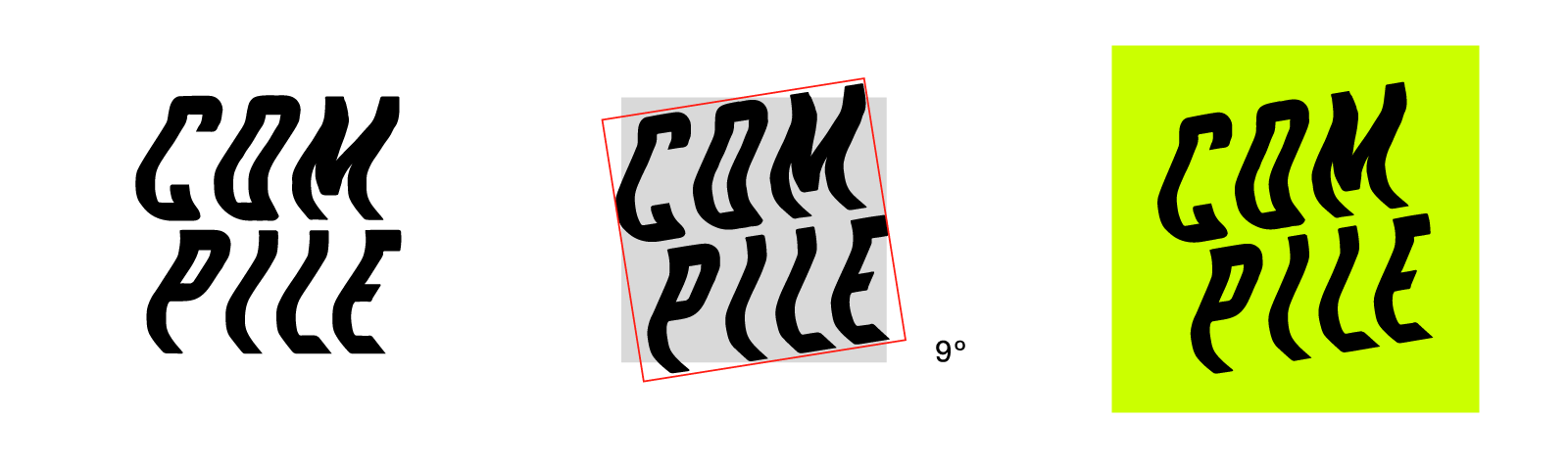
I ultimately made the Compile wordmark by manipulating type using a scanner. This solution not only embodied the subversive streak of the magazine, but was itself the direct product of digital technology and human intervention.


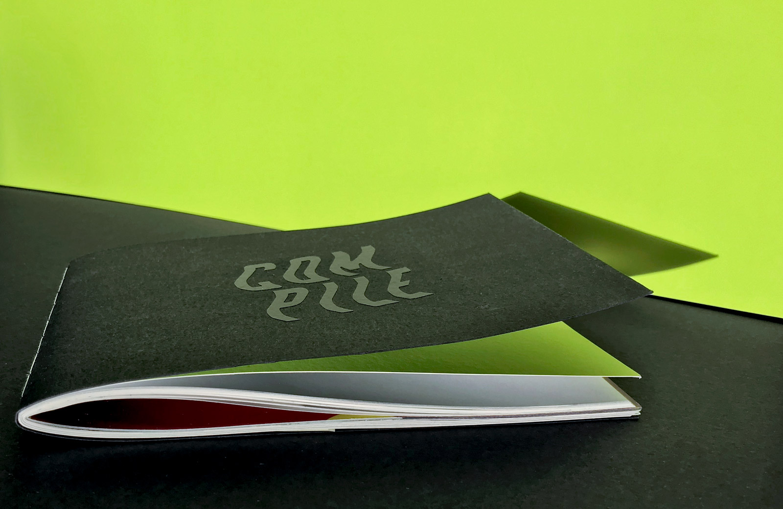
Process book
In addition to fully curating, designing, and developing Compile, I made a 68-page hand-bound process book. The book contains a detailed step-by-step overview of my 14-week design process. If you're interested, you can download a PDF version.